Doing Everything Wrong

My work with Live Forever Die Whenever has easily been some of the most enlightening and some of the strangest, and that’s not an accident (that first part, at least). Creatives often struggle with accomplishing their goals vis-à-vis business and focusing way too much on art, in this instance I nearly missed the goal vis-à-vis art by treating it too much like a business.
LFDW is a specific, niche, vintage brand, and a specifically pulpy one at that. They want video content to help feed the IG Reels demon, something unique to them. Now their normal method of feeding the content demons is to post old video and print content from the eras they replicate, and since they’re a more fun-focused brand, a lot of that content is, well, it’s just bad. But that stuff, being decades old, doesn’t say anything really, about who they are and their vision. It just provides a general vibe. They need video of the stuff they’re doing right now.
As a colorist you’re taught a lot of specific rules and given specific goals, and these help align you to your main goal of making beautiful, cinematic images. You use special tools to get good highlight and shadow rolloff, you use other tools to shape the color and light in the frame, and you do all of this with the goal of providing an image that compresses the massive dynamic range of human sight into an image that a screen can display, while still containing all of that wealth of visual information.
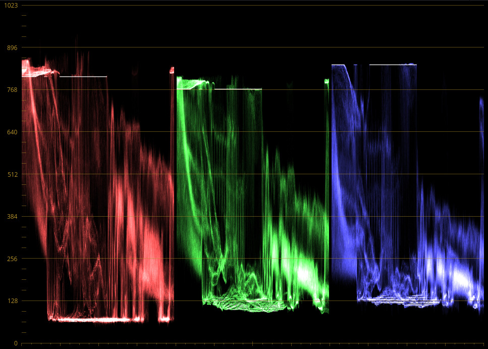
I followed these rules by default with a lot of my early work for them, and the footage came out… great. And it didn’t fit their brand at all, and their customers didn’t take to it. After a lot of research and adjustment, I’ve changed how I do their grading to the image you see above.
For you non-colorists out there, that’s a scope which shows the brightness of each pixel relative to its color value (Red, Green, and Blue are the colors present in pixels and human sight, all other colors are some mix of those three), and it looks like trash. On any Hollywood style grading job, this would be a good cue to fire the colorist and demand a refund. Those hard lines you see blocking out the top and bottom of the color swatches are where I am actively and intentionally tearing the image to pieces. Clipping the highlights, and simultaneously stomping on and lifting the blacks.
But it works, for this client, because everything else they post looks like that. Sometimes instead of “deep artistic vision” you really need to focus on “make it look like sh*t”.
I guess the moral here is that if your garbage man smells like flowers, he’s failing at his job.